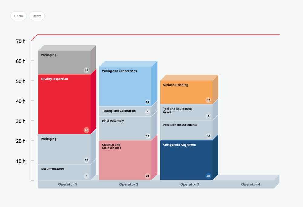
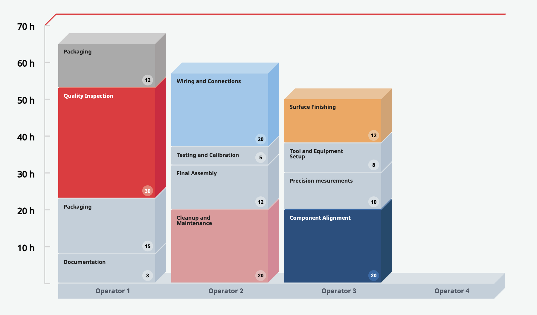
A Yamazumi chart is a stacked bar chart used primarily in lean manufacturing and process analysis to visualize the balance of work between different steps in a process. The word "Yamazumi" is Japanese and translates as "to stack up." In this chart, each bar represents an individual process step, and the height of each segment within a bar corresponds to the time taken for that portion of the process. The primary purpose of the Yamazumi chart is to identify and eliminate waste, such as waiting times or overproduction, by highlighting imbalances and inefficiencies in the process. By stacking the activities, one can easily compare the work content across different steps (operators in our case) and make improvements to create a smoother, more balanced flow.
Demo instructions
When you hover over the tasks, you will see tools that allow you to increase or decrease the duration of the task (using the input field or slider) or delete the task. Drag and drop elements into different stacks to balance the workload. Note the error message when you try to stack processes with a total duration longer than the takt time.
The source code of this demo is available as part of the JointJS+ commercial license. Don't have a license yet? Start a trial and use the source code of this and many other demos for free, with no obligations, for 30 days.
All features required to build this demo are included in the commercial JointJS+ package. Don't have a license yet? Start a trial and build professional applications with ease.
All features required to build this demo application are included in our open-source library, JointJS. Download the package and create basic visual applications in no time.
The role of JointJS in building a Yamazumi 3D Chart
JointJS, a powerful diagramming library, helps developers and companies of any size build advanced visual applications and No-Code/Low-Code tools. It provides a wealth of ready-made demos and a wide range of prebuilt features that make creating applications such as Yamazumi 3D Chart a breeze.
We equip developers with all the plugins they need to save time and focus their energy elsewhere such as StackLayoutView, StackLayout, CommandManager, and Toolbar.
New to this topic? Learn more about Yamazumi Charts 👇
What is a Yamazumi Chart?
To explain the meaning of the Yamazumi charts, we'll have to visit the beautiful country of Japan – that's where this technique of eliminating waste in a production process comes from. The Japanese word Yamazumi literally means to stack up which probably comes as no surprise after seeing the demo above. The goal of Yamazumi Charts is to eliminate non-value added activities in a certain process by visually presenting the work content and shedding light on what activities add value and what don't.
4 key steps to create a Yamazumi Chart
Peter Drucker once said: "If you can't measure it, you can't improve it." It was more about marketing than process optimization, but the same quote could be appropriately applied here. Creating a Yamazumi Chart and evaluating which activities are wasteful and which are not begins with identifying those activities, measuring them, and improving them. Let's briefly go through each of the steps.
1. Calculating takt time
Let's borrow the Kanbanize explanation that nicely explains the meaning of this term. “Takt time is the rate at which you need to complete a product to meet customer demand. For example, if you receive a new product order every 4 hours, your team needs to finish a product in 4 hours or less to meet demand.” The formula would look as follows: available work time / customer demand rate. For example, if the customers need 10 units a day and your shop has 700 working hours a day, the takt time is 70.
2. List the process step and cycle time
For each process step, indicate the cycle time, which is the time it takes to complete the activity from start to finish. At this point, your Yamazumi chart would already contain the takt time and processes and would look similar to the one below:
3. Process analysis: Value added & value non-added
The next step is to identify value-added and non-value-added activities in the processes. The elimination of wasteful activities really starts at this point, as you will gain insight into which activities are not leading to the expected outcome.
4. Line balancing analysis
This strategy helps match the production rate to takt time. As Tulip puts it, “Line balancing is a production strategy that involves balancing operator and machine time to match the production rate to the takt time. For a given production line, if production time is exactly equal to takt time, then the line is perfectly balanced.” You can read more in their great article that explains more about this strategy.
The benefits of a Yamazumi chart
The benefits of this lean manufacturing strategy have already been mentioned above. At the core is the increased efficiency achieved by being able to change the process as the takt time changes and to gain visual insight into overloaded and underutilized operations.
Ready to take the next step?
Modern development is not about building everything from scratch. The JointJS team equips you with plenty of ready-to-use demo apps that can serve as a boilerplate and radically reduce your development time. Start a free 30-day JointJS+ trial, get the source code of the Yamazumi 3D demo application, and go from zero to a fully functional app in no time.