Getting Started with JointJS+
Quick Start Guide
A lot of diagramming apps tend to share a common layout and widgets. Let's explore this pattern and use the same naming as JointJS+ uses for its UI widgets. Note that your own apps can look very different and use different functionality. JointJS+ supports wide customization possibilities. However, for simplicity, let's assume our app looks like this:
If you look at the KitchenSink demo application code, you'll notice the same naming for the UI widgets. If we decompose the KitchenSink demo app and simplify it greatly, we can see the following sections in the code:
-
Initialize Graph (diagram model)
Graph is the underlying model of the diagram. It contains elements (nodes) and links (edges, connections between nodes) and provides a variety of algorithms to efficiently traverse the graph. Learn more.
const graph = new joint.dia.Graph({}, { cellNamespace: joint.shapes }); -
Create Paper (graph view) & PaperScroller (paper wrapper)
Paper is a view for our graph model. It reacts on changes in the graph and (re)renders views for elements and links automatically. PaperScroller wraps paper and provides a smaller viewport to a (possibly) large paper area with scroll and zoom capabilities. Learn more about Paper and PaperScroller.
const paper = new joint.dia.Paper({
    model: graph, // Set graph as the model for paper
    cellViewNamespace: joint.shapes,
    width: 1000,
    height: 1000,
    gridSize: 10,
    drawGrid: true,
    defaultLink: (elementView, magnet) => {
        return new joint.shapes.standard.Link({
            attrs: { line: { stroke: 'white' } }
        });
    },
    async: true,
    sorting: joint.dia.Paper.sorting.APPROX,
    interactive: { linkMove: false },
    snapLinks: { radius: 70 },
    defaultConnectionPoint: { name: 'boundary' }
});
const paperScroller = new joint.ui.PaperScroller({ paper, autoResizePaper: true, cursor: 'grab' }); document.querySelector('.paper-container').appendChild(paperScroller.el); paperScroller.render().center(); paper.on('blank:pointerdown', (evt) => { // Start panning the paper on mousedown paperScroller.startPanning(evt); }); -
Create Stencil (element palette)
Stencil is a UI widget that renders a palette of shapes that can be dragged-and-dropped to the paper. Stencil can have search and groups (accordion-like) and can be populated with a custom selection of shapes. Learn more.
const stencil = new joint.ui.Stencil({ paper: paperScroller, scaleClones: true, width: 240, groups: { myShapesGroup1: { index: 1, label: ' My Shapes 1' }, myShapesGroup2: { index: 2, label: ' My Shapes 2' } }, dropAnimation: true, groupsToggleButtons: true, search: { '*': ['type', 'attrs/label/text'] }, layout: true // Use the default 2 columns layout with auto-resize }); document.querySelector('.stencil-container').appendChild(stencil.el); stencil.render().load({ myShapesGroup1: [ { type: 'standard.Rectangle' }, { type: 'standard.Ellipse' } ], myShapesGroup2: [ { type: 'standard.Cylinder' }, { type: 'myApp.MyShape', attrs: { label: { text: 'Shape' } }, ports: { items: [{ group: 'in' }, { group: 'out' }, { group: 'out' }] } } ] }); -
Create Inspector (properties editor)
Inspector is a property editor. Based on a JSON configuration, inspector automatically generates HTML forms that keep a two-way data binding with the properties of cells (elements or links) in the graph. Two-way data binding means that when the user changes a value of a field in the inspector UI, the underlying data model changes too so if you then export your graph to JSON, the value will be there. Also, the other way around, if you change the model programmatically, the inspector will notice and re-render the UI to reflect the new values. Learn more.
Notice that we create the inspector when the user clicks on an element in the paper. This is one example how you can show the inspector. You might have other uses cases where the Inspector is visible all the time, opened on click of a link, opened on click of a special button, etc ...paper.on('element:pointerclick', (elementView) => { joint.ui.Inspector.create('.inspector-container', { cell: elementView.model, inputs: { 'attrs/label/text': { type: 'text', label: 'Label', group: 'basic', index: 1 }, level: { type: 'range', min: 1, max: 10, unit: 'x', defaultValue: 6, label: 'Level', group: 'advanced', index: 2 } }, groups: { basic: { label: 'Basic', index: 1 }, advanced: { label: 'Advanced', index: 2 } } }); }); paper.on('link:pointerdown blank:pointerdown', () => { joint.ui.Inspector.close(); }); -
Create Control Panels (Halo - element control panel & Link tools)
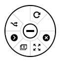
Halo is a control panel above elements. It's a mini-toolbar that gives users a "quick" menu of actions. Halo provides built-in actions such as "remove" or "clone" but it also allows you to define your own custom actions. Apart from the default style of the Halo (where controls are spread around the element), you can choose from two other layouts: pie menu
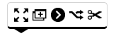
 and toolbar
 .
Learn more.
.
Learn more.
paper.on('element:pointerclick', (elementView) => {
    const handles = [
        { name: 'remove', position: 'nw', events: { pointerdown: 'removeElement' } },
        { name: 'myCustomAction', position: 'ne', icon: 'myCustomAction.png' }
    ];
    if (!elementView.model.hasPorts()) {
        // Only shapes without ports will have the "link" handle in the Halo control panel. Shapes with ports can be connected by "dragging" ports.
        handles.push({ name: 'link', position: 'e', events: { pointerdown: 'startLinking', pointermove: 'doLink', pointerup: 'stopLinking' } });
    }
    const halo = new joint.ui.Halo({
        cellView: elementView,
        handles
    }).render();
    halo.on('action:myCustomAction:pointerdown', (evt) => {
        alert('My Control Button Clicked!');
    });
});
Link tools are tools that allow the user to interact with links. JointJS+ provides common tools such as "remove" to allow the user to remove links,"vertices" that allow changing position of vertices of a link, etc. Learn more.
paper.on('link:pointerclick', (linkView) => { paper.removeTools(); const toolsView = new joint.dia.ToolsView({ tools: [ new joint.linkTools.Vertices(), new joint.linkTools.SourceArrowhead(), new joint.linkTools.TargetArrowhead(), new joint.linkTools.Segments, new joint.linkTools.Remove({ offset: -20, distance: 40 }) ] }); linkView.addTools(toolsView); }); paper.on('blank:pointerdown', () => { paper.removeTools(); }); -
Create Toolbar
Toolbar is a UI widget that renders buttons and other controls in a horizontal panel. It provides built-in tools such as undo, redo or zoom buttons but you can also define your own custom controls (such as "clear" in the example code below). Learn more.
const toolbar = new joint.ui.Toolbar({ groups: { 'clear': { index: 1 }, 'zoom': { index: 2 } }, tools: [ { type: 'button', name: 'clear', group: 'clear', text: 'Clear Diagram' }, { type: 'zoom-out', name: 'zoom-out', group: 'zoom' }, { type: 'zoom-in', name: 'zoom-in', group: 'zoom' } ], references: { paperScroller // built in zoom-in/zoom-out control types require access to paperScroller instance } }); toolbar.on({ 'clear:pointerclick': () => graph.clear() }); document.querySelector('.toolbar-container').appendChild(toolbar.el); toolbar.render(); -
Create Custom Shapes
JointJS+ allows you to define your own custom shapes. Shapes are specified by combining SVG primitives, such as rectangle, text, ellipse, image, or generic path. The code below shows you a definition of the simple shape used in the Stencil example above. Learn more.
const MyShape = joint.dia.Element.define('myApp.MyShape', { attrs: { body: { width: 'calc(w)', height: 'calc(h)', strokeWidth: 2, stroke: '#000000', fill: '#FFFFFF' }, label: { x: 'calc(w/2)', y: 'calc(h/2)', textAnchor: 'middle', textVerticalAnchor: 'middle', fontSize: 14, fill: '#333333' }, root: { // Disable the possibility to connect the body of our shape. Only ports can be connected. magnet: false } }, level: 1, ports: { groups: { 'in': { markup: joint.util.svg`<circle @selector="portBody"/>`, z: -1, attrs: { portBody: { r: 12, magnet: true, fill: '#7C68FC' } }, position: { name: 'left' }, label: { position: { name: 'left' } } }, 'out': { markup: joint.util.svg`<circle @selector="portBody"/>`, z: -1, attrs: { portBody: { r: 12, magnet: true, fill: '#7C68FC' } }, position: { name: 'right' }, label: { position: { name: 'right' } } } } } }, { markup: joint.util.svg` <rect @selector="body" /> <text @selector="label" /> ` }); -
Export Diagram to JSON
At any point in time, you can export your diagrams to JSON format using a single function call (graph.toJSON()). Then, you can send your diagram to your server with AJAX, WebSockets, form submission or other means and store it in your database. Learn more.
const diagramJSONString = JSON.stringify(graph.toJSON());To reconstruct your diagrams back from JSON, use:
graph.fromJSON(JSON.parse(diagramJSONString)); -
Working With Diagrams Programmatically
You can change your diagrams programmatically. For example, you can add new elements, remove elements, connect elements with links, react on changes in the graph, change element properties, etc. See some examples below. Learn more.
// Add new element to the graph.
const myShape = new MyShape({
    size: { width: 100, height: 100 },
    position: { x: 50, y: 50 },
    attrs: {
        label: { text: 'My Shape' }
    },
    level: 3,
    ports: { items: [{ id: 'in1', group: 'in' }, { group: 'out', id: 'out1' }] }
});

graph.addCell(myShape);
// Get element from the graph and change its properties. console.log(myShape === graph.getElements()[0]); myShape.prop('attrs/label/text', 'My Updated Shape'); myShape.prop('size/width', 150); myShape.prop('level', 2); myShape.prop('attrs/body/fill', '#FE854F');// Create a clone of an element. const myShape2 = myShape.clone(); myShape2.translate(400, 0); graph.addCell(myShape2);// Create a link that connects two elements. const myLink = new joint.shapes.standard.Link({ attrs: { line: { stroke: 'white' } }, source: { id: myShape.id, port: 'out1' }, target: { id: myShape2.id, port: 'in1' } }); graph.addCell(myLink);// React on changes in the graph. graph.on('change add remove', () => { const diagramJSONString = JSON.stringify(graph.toJSON()); console.log('Diagram JSON', diagramJSONString); }); graph.on('change:level', (cell) => { if (cell.prop('level') > 8) { cell.prop('attrs/body/fill', 'red'); } else { cell.prop('attrs/body/fill', 'white'); } });// Remove all links. const links = graph.getLinks(); links.forEach((link) => link.remove()); -
Styling your application
JointJS+ provides three built-in themes that help you quick-start your application development. However, any widget can be customized to meet your specific needs. You can just use CSS to style your application. In our example app, we set the built-in 'dark' theme.
joint.setTheme('dark');Next to that, we need to provide HTML containers for our widgets and the bare minimum CSS for them. Basically, we just specify how big the containers are and where on the page they are positioned.
<div class="toolbar-container"></div>
<div class="stencil-container"></div>
<div class="paper-container"></div>
<div class="inspector-container"></div>
/* Paper */ .paper-container { position: absolute; height: 100%; overflow: hidden; top: 50px; /* space for toolbar */ left: 240px; /* space for stencil */ right: 240px; /* space for inspector */ } /* Inspector */ .inspector-container { position: absolute; top: 0; right: 0; bottom: 0; width: 240px; } /* Stencil */ .stencil-container { position: absolute; left: 0; top: 0; bottom: 0; width: 240px; } /* Toolbar */ .toolbar-container { position: absolute; height: 50px; left: 240px; /* space for stencil */ right: 240; /* space for inspector */ } -
Final result
Open our demo app and study the full source code and stylesheet.
Support
We're happy to help! We offer multiple support channels. See https://www.jointjs.com/support for more information.
-
Note on the documentation: You'll notice the documentation is split into multiple sections: JointJS+, JointJS, Geometry and Vectorizer. A good rule to find your way in the documentation is to:
- See JointJS documentation when looking for things related to the core, i.e. graph, paper, elements and links.
- See JointJS+ documentation when looking for more high level widgets such as Stencil, Inspector, Undo/Redo (CommandManager), ...
- See Geometry documentation when looking for math and algorithms useful in 2D space, i.e. distance between two points, line intersection, angle calculations, ...
- See Vectorizer documentation when looking for SVG helpers (only advanced usage, usually not necessary for most cases)
- FAQ
- Paid Support Plans
- Online Communities
- Custom Development Service
LICENSE
The JointJS+ framework is licensed under the JointJS+ License. An online version of the license is available at https://www.jointjs.com/license.